


Project Notes
As one travels through life, various situations present
themselves that can be difficult to deal with. We often try to ignore
such things, feeling embarrassed or ill equiped to confront them, and
we try to get on with our lives in blissful ignorance, hoping the problems
will resolve themselves. However, they do not always go away and instead
can grow, and even become all consuming as time goes on.
I made these photographs as a way to acknowledge my own concerns. It's
the first step in actually deciding to deal with them. These images do
not relate to those specifically, but in a broader sense, to represent
the general concept of "worries unspoken, of feelings repressed,
and troubles forthcoming"... the type of thoughts and emotions that
are likely to affect everyone at times during life.
The causes can be wide ranging, from the deeply personal, such as a financial
struggle, a medical condition, or a family problem, to something that
affects us all as a wider society, like climate change or impending war.
I chose to make these photographs in domestic settings because I feel
it is often in the privacy of home, where we should feel the most secure,
that concerns can manifest and grow.
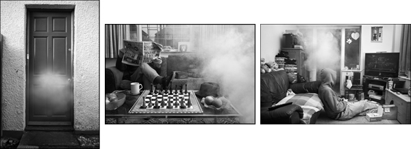
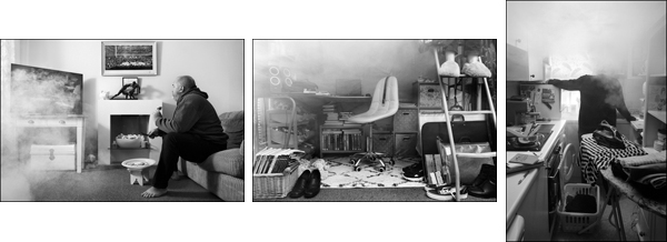
The series is presented
in my Portfolio as black and white images, the photographs made in
my preferred way using my Leica CL digital camera. However, each scenario
was also photographed on colour film, using a Mamiya RZ67 pro ii medium
format camera which creates 56mm x 70mm size negatives. I printed these
images in a colour darkroom and scanned the prints, which are shown below.
I thought some words about them in comparison to the black and white images
may be of interest to some people. I have also expanded further with some
notes regarding the other thoughts and the decisions I made when creating
this series.
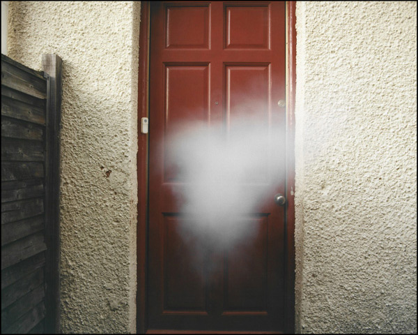
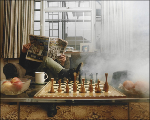
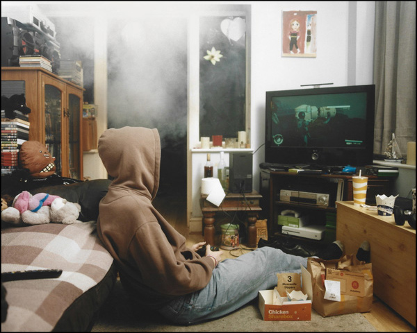
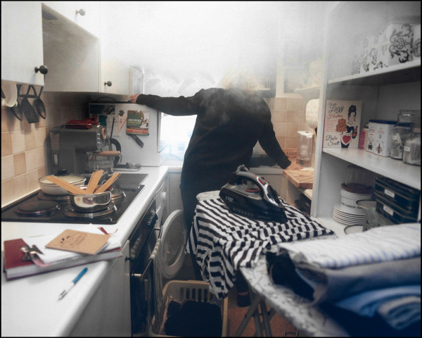
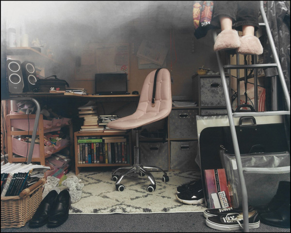
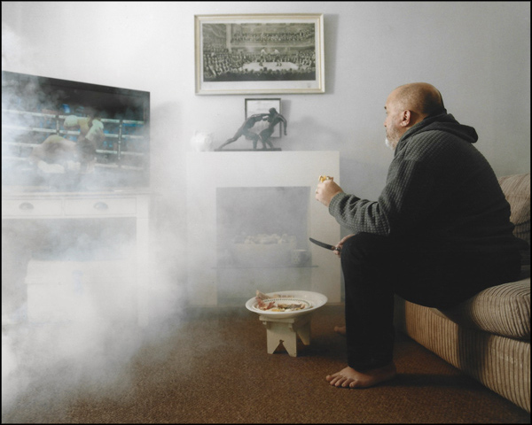
When considering how to represent something intangible like a thought
or feeling, I remembered how the depiction of thought was commonly seen
in comic books with the thinking bubble or cloud. I started to think of
ways I could incorporate such a cloud into the images, how it could perhaps
emanate from the people's heads like in the comics but I soon felt this
idea seemed too naive and not very sophisticated.
I then considered the cloud differently, not as something emanating from
the person but instead as its own separate entity. Although this
entity could be related to the individual, a reflection of their state
of mind, it didn't need to be of the individual. If this cloud
was to represent the intangible senses of worry, thoughts and feelings,
then its placement and size could be representative too. A small cloud
further away might indicate a less intense feeling than a larger cloud
engulfing the person.
I bought an inexpensive fog machine, controlled by a single button which
would release a cloud capable of filling a room in seconds. Each scenario
could only be photographed a couple of times before it was necessary to
wait for the air to clear. Deciding exactly when to open the shutter became
important, as each cloud quickly grew and changed shape. These split second
decisions were similar to those I am used to making in my music photography.
Too slow, and the moment has gone.
The first photograph in the series, featuring the door, was not the first
scenario I photographed. It differs from the rest in a significant way
as it does not include a person. I felt the series needed an introduction
to the domestic setting and also to the cloud as an entity. The scene
can also be thought of as being viewed in the first person. It shows an
unusual situation and encourages the viewer to ask questions.
My intention for using colour film and a colour darkroom was to help imbue
a sense of everyday normality into the photographs as seeing in colour
is how most people view the world. Making images in a traditional non-digital
way also removes the temptation for over processing and manipulation.
The characteristics of colour and contrast become naturally limited to
those of the film and paper used and I hoped this would ground the viewer
in a sense of reality.
This sense of everyday normality was important to me and each scenario
was constructed to feel that way, with careful consideration for props
and composition. Every setting was lit by portable studio flash units
to create light that appeared natural whilst adding consistency across
the series. When making these tableaus I was influenced by works from
photographers such as Gregory Crewdson, Jeff Wall, and Frances Kearney
who all made staged photographs with a fine eye for details.
Despite my thinking around the use of colour, I have since found myself
preferring the monochrome images. I now believe that the use of colour
encourages the viewer to read the images more indexically than I would
like. For instance, due to the domestic settings, some viewers may see
smoke rather than a cloud, and think of that as an indication of an unseen
fire. This therefore changes how the message I hope to communicate is
understood. In my opinion the monochrome versions place the viewer in
a more symbolic mindframe better positioned to think metaphorically.
Whatever a viewer's interpretation may be, I accept it may differ from
my intention. The understanding of any image will partly come from one's
own life experience. Hopefully, some viewers will be able to find something
in at least one of the images that they can relate to their own lives,
whatever their personal circumstances.
I have made efforts to anonymise the people shown in the images. This
is because the images are not about them (the images are not portraits),
but rather they are there because they represent something, such as an
age group or a section of society. Of course, it is impossible to represent
every section of society, especially in this short series that time has
allowed for so far. I acknowledged that to represent these aspects in
the broadest sense certain stereotypes may be necessary.
On a more technical note, the more I study photography the more I seem
to prefer the 3:2 ratio of the digital (or 35mm film) cameras. Comparing
this ratio with the 4:5 ratio of the Mamiya medium format film camera
I used for these photographs here, I believe the wider 3:2 landscape or
taller 2:3 portrait images feel more expansive.
If I had a medium format camera with a 6x9 film back I would have used
it, but I didn't, and in any case was happy to use the 6x7 format of the
Mamiya RZ67 pro ii instead. The main decision to use medium format film
was because I felt the bigger area of film would allow for more detailed
images. Theoretically, this should be the case, but in practice with the
equipment I used, there was very little effective difference in detail
between the images created by the Mamiya and the Leica.
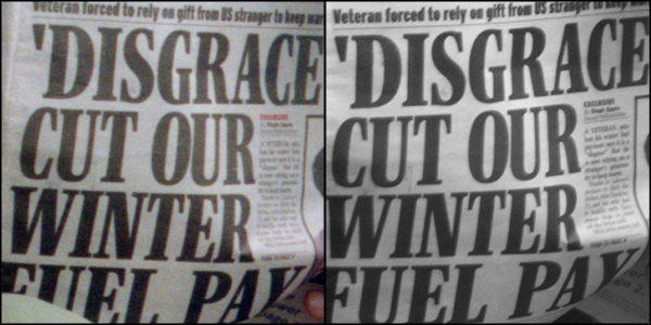
The comparison images above are from the second scenario in the series,
a very small part of the overall image. Here the colour image comes from
a scan of the negative using a Hasselblad Flextight X5 scanner which made
an image of around 60MP (8642 x 7021px). The monochrome image has been
resized upwards from its original 6000 x 4000px to render a similar size
using Photoshop. As can be seen, neither have been sharpened. Both have
then been downsized equally for this page.
Obviously, this process does not provide a perfectly scientific comparison.
That is not my intention here, but rather to show a fair representation
of what I see in my experience of working with these images. My conclusion
is that a Leica CL camera with the Vario-Elmar-TL 18-56mm lens can make
images as detailed as the Mamiya RZ67 pro ii camera with the Sekor Z 50mm
f/4.5 lens using Kodak Gold 200 film.
My feeling is that this is due to two factors... the high resolving capability
of the more advanced Leica lens compared to the Mamiya Sekor Z lens made
over forty years earlier, and also the sharp rendering from the Leica
camera's sensor (the CL does not have an anti-aliasing filter) compared
to that from Kodak Gold film with its inherent grain structure. There
are other films that can produce sharper images.
Finally, a reminder that the images in the series so far form the foundation
for a wider more representational portrayal that I would like to realise
as I move the project onwards. If anyone would like to be a part of this
project, either an individual or individuals happy to be photographed,
or a charitable organisation who could find use for the images, then please
do contact me.
(Published 10/06/2025)

© GREIG CLIFFORD.
ALL IMAGES ARE SUBJECT TO COPYRIGHT LAWS.
ALL RIGHTS RESERVED.
Cookies